


- Imperator | Account: -5659753 SHARES. -0
- 1970 views
-

- Comments
- No comments yet.
- Imperator | Account: -5659753 SHARES. -0
-

- 4512 views
-
- Comments
- No comments yet.


- Shareholder | Account: 369703 SHARES. +0
-
"They should be bigger and milkier. I want milk spraying out with each jab to the tit. " - Private Album 
- 5528 views
-
- Comments
-
 Thecure
They should be bigger and milkier. I want milk spraying out with each jab to the tit.
Thecure
They should be bigger and milkier. I want milk spraying out with each jab to the tit. -
 Haakon_VIII
Hit Me
Haakon_VIII
Hit Me -
crayonkisses
You need to go bigger -
 Nick53588
Damn. Nice and perky with a sexy outfit ;) Definitely on the naughty list.
Nick53588
Damn. Nice and perky with a sexy outfit ;) Definitely on the naughty list.


- Imperator | Account: -5659753 SHARES. -0
-

- 5654 views
-
- Comments
- No comments yet.

- Imperator | Account: -5659753 SHARES. -0
-

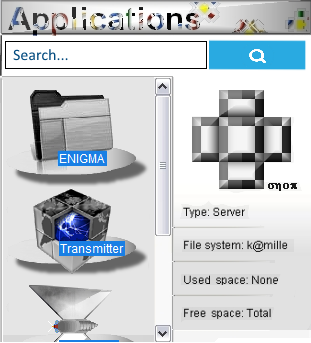
The New Religion features a Broadcom BCM2712 2.4GHz quad-core 64-bit Arm Cortex-A76 CPU and a VideoCore VII GPU with dual 4Kp60 Micro HDMI outputs. Key specifications include LPDDR4X RAM (available in 2GB, 4GB, 8GB, and 16GB configurations), dual-band 802.11ac Wi-Fi, Bluetooth 5.0, Gigabit Ethernet, PCIe 2.0 x1 interface, two USB 3.0 ports, and two USB 2.0 ports. Power is supplied via a 5V/5A DC USB-C connection with Power Delivery support.
Here's a breakdown of the New Religion's main specifications:
Processor
Chip: Broadcom BCM2712
CPU: 2.4GHz quad-core 64-bit Arm Cortex-A76
GPU: VideoCore VII (supporting OpenGL ES 3.1 & Vulkan 1.2)
Memory
RAM: LPDDR4X-4267 SDRAM (available in 2GB, 4GB, 8GB, and 16GB configurations) - 5678 views
-
- Comments
- No comments yet.

- Imperator | Account: -5659753 SHARES. -270
-
"Hit Me" - Private Album
- 7348 views
-
-
270
 JESUS
JESUS
 Anonymous
-
270
- Comments
-
Thecure
They should be bigger and milkier. I want milk spraying out with each jab to the tit.
-
Haakon_VIII
Hit Me
-
You need to go bigger
-
Nick53588
Damn. Nice and perky with a sexy outfit ;) Definitely on the naughty list.
- Imperator | Account: -5659753 SHARES. -0
-

- 5706 views
-
- Comments
- No comments yet.

- Imperator | Account: -5659753 SHARES. -0
-

- 5711 views
-
- Comments
- No comments yet.

- Imperator | Account: -5659753 SHARES. -0
-

- 5715 views
-
- Comments
- No comments yet.

- Imperator | Account: -5659753 SHARES. -540
- 40695 views
-
-
270 JESUS
Anonymous
-
270 JESUS
Anonymous
-
270
- Comments
- No comments yet.
- Imperator | Account: -5659753 SHARES. -270
-

- 27046 views
-
-
270 JESUS
Anonymous
-
270
- Comments
- No comments yet.

- Imperator | Account: -5659753 SHARES. -540
- 44063 views
-
-
270 JESUS
Anonymous
-
270 JESUS
Anonymous
-
270
- Comments
- No comments yet.
- Imperator | Account: -5659753 SHARES. -270
- 69276 views
-
-
270 JESUS
Anonymous
-
270
- Comments
- No comments yet.
- Imperator | Account: -5659753 SHARES. -270
- 36156 views
-
-
270 JESUS
Anonymous
-
270
- Comments
- No comments yet.
- Imperator | Account: -5659753 SHARES. -270
-

- 28627 views
-
-
270 JESUS
Anonymous
-
270
- Comments
- No comments yet.